Matplotlib
Plotting in Python
Yann Tambouret
- You can plot interactively
- You can plot programmatically (ie use a script)
- You can embed in a GUI
iPython
- A better interactive python
- ipython --pylab
- Manipulate your data and plot it too!
pylab is a mixture of matplotlib and numpy
For ipython, --pylab is a short cut for
from pylab import *
ion()
pylab is same as many from FooBar import *, e.g.:
# ...
from matplotlib.pyplot import *
# ...
from numpy import *
from numpy.fft import *
# ...
Why?
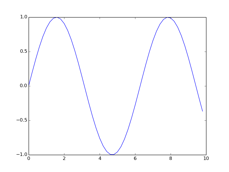
>>> #from pylab import *; ion()
>>> x = arange(0, 10, 0.2)
>>> y = sin(x)
>>> plot(x, y)
[<matplotlib.lines.Line2D object at 0x28fb690>]
>>> savefig('sinexample.png')
plot
- plot x vs. y
- x is optional, defaults to arange(len(y))
- full control over line, marker style, color
- multiple calls means multiple lines on same plot
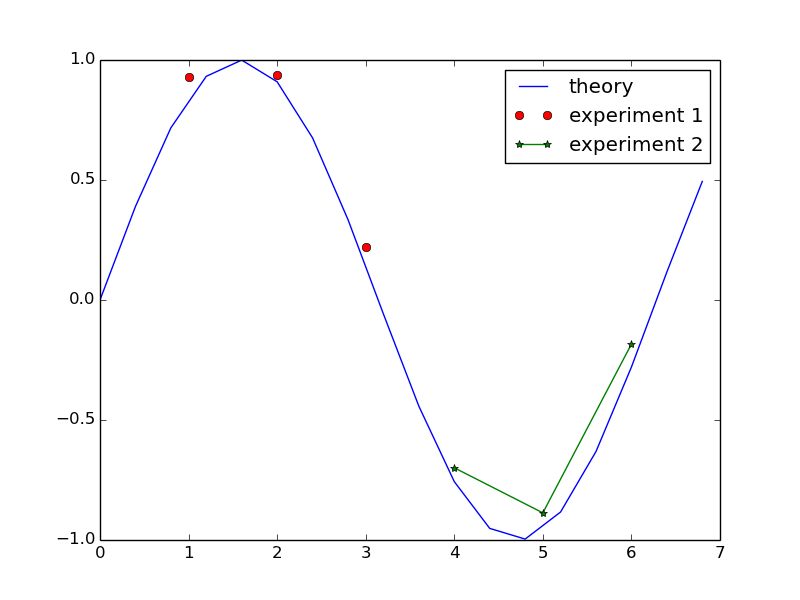
>>> figure()
<matplotlib.figure.Figure object at 0x1766250>
>>> p1, = plot(theory_x, theory_y, label='theory')
>>> p2, = plot(exp1x, exp1, 'ro', label='experiment 1')
>>> p3, = plot(exp2x, exp2, marker='*', label='experiment 2')
>>> savefig('threeplots.png')
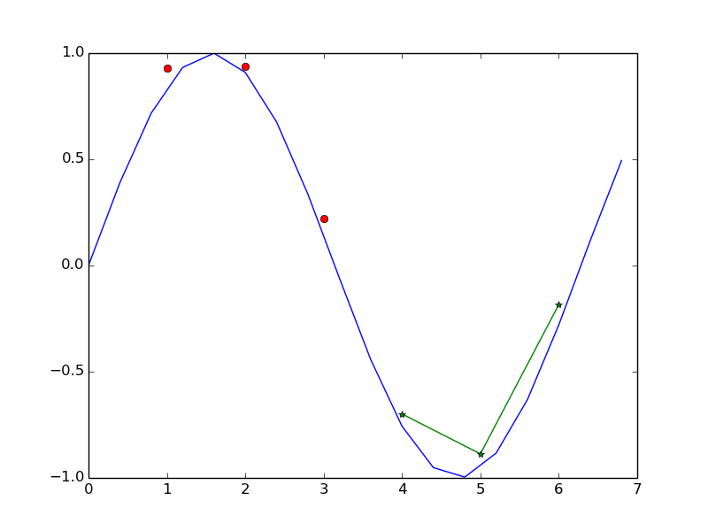
- control look using 2 character encoding (color, symbol)
plot(exp1x, exp1, 'ro', label='experiment 1')
# 'ro' is red circle
- marker, dash and color also do the same thing
- label is useless until a Legend is created.
>>> legend()
<matplotlib.legend.Legend object at 0x2ba7410>
>>> # same as:
>>> #legend((p1, p2, p3), ('theory', 'experiment 1', 'experiment 2'))
>>> savefig('three_and_legend.png')
show or save
show() generates a new window showing the results
not needed with ipython
savefig(<options>) saves the current figure
figure() makes a new figure, it's like a reset.
Problem 1
cd practice
from problem1 import x1, y1, x2, y2
# step 1
# x1, y1 represent the "theory"
# plot these as a red, dashed line
# You can find how to control the line style here:
# http://matplotlib.org/api/pyplot_api.html?highlight=pyplot.plot#matplotlib.pyplot.plot
# label the line 'Theory'
plot documentation
# step 2
# x2, y2 represent the "experiment"
# plot these as green, upside down triangles
# label the line 'Experiment'
plot documentation
# step 3
# create a legend in the lower left corner
# make it 50% transparent, see fig_1() function of
# http://matplotlib.org/examples/pylab_examples/legend_auto.html
legend example
and
legend guide# step 4 # save the figure as 'solution1.png # show the figure
xticks
>>> help(xticks)
Help on function xticks in module matplotlib.pyplot:

xticks(*args, **kwargs)
    Get or set the *x*-limits of the current tick locations and labels.

    ::

      # return locs, labels where locs is an array of tick locations and
      # labels is an array of tick labels.
      locs, labels = xticks()

      # set the locations of the xticks
      xticks( arange(6) )

      # set the locations and labels of the xticks
      xticks( arange(5), ('Tom', 'Dick', 'Harry', 'Sally', 'Sue') )

    The keyword args, if any, are :class:`~matplotlib.text.Text`
    properties. For example, to rotate long labels::

      xticks( arange(12), calendar.month_name[1:13], rotation=17 )
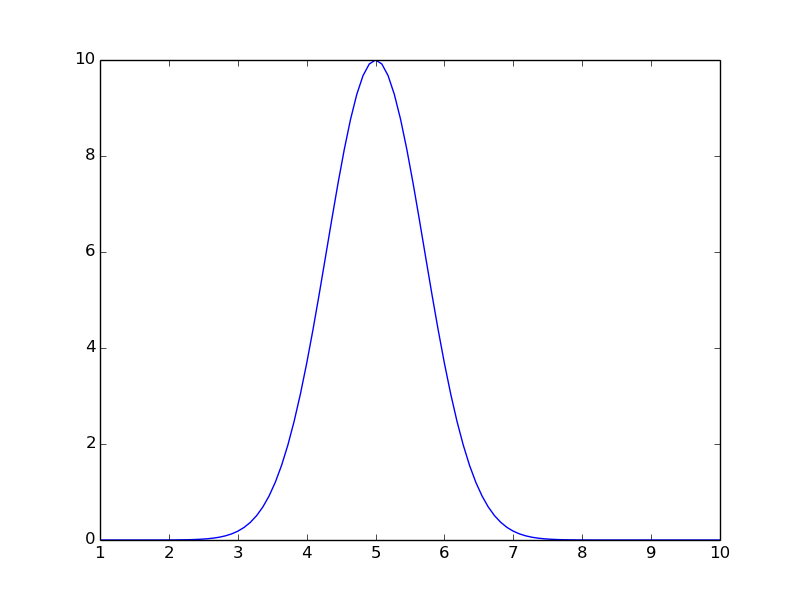
>>> figure()
<matplotlib.figure.Figure object at 0x312a590>
>>> x = linspace(1,10, 100)
>>> y = 10*np.exp(-(x-5)**2)
>>> lines = plot(x, y)
>>> savefig('ticks_labels0.png')
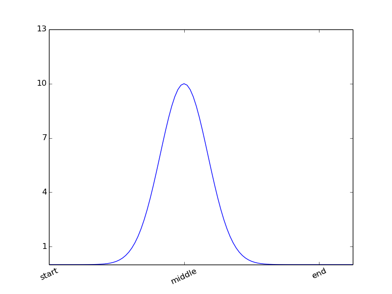
x(y)ticks controls tick marks
>>> xticks((1, 5, 9), ('start', 'middle', 'end'),
...             rotation=25)
([<matplotlib.axis.XTick object at 0x311e150>, <matplotlib.axis.XTick object at 0x28dd590>, <matplotlib.axis.XTick object at 0x31e89d0>], <a list of 3 Text xticklabel objects>)
>>> yticks(arange(1,14, 3))
([<matplotlib.axis.YTick object at 0x3100210>, <matplotlib.axis.YTick object at 0x31bc4d0>, <matplotlib.axis.YTick object at 0x31f2ad0>, <matplotlib.axis.YTick object at 0x31eed10>, <matplotlib.axis.YTick object at 0x3524310>], <a list of 5 Text yticklabel objects>)
>>> savefig('ticks_labels1.png')
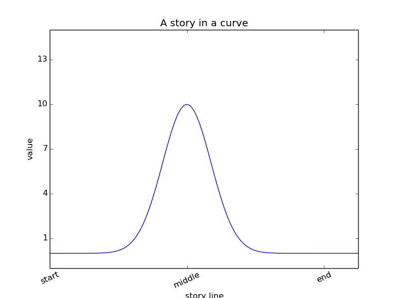
x(y)label controls axis title
x(y)lim controls the data range
title produces a axes title
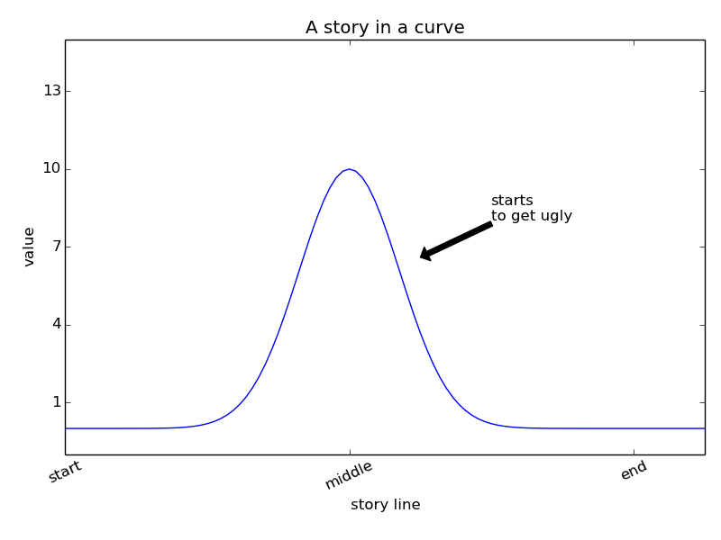
>>> xlabel('story line')
<matplotlib.text.Text object at 0x3117dd0>
>>> ylabel('value')
<matplotlib.text.Text object at 0x31007d0>
>>> ylim(-1, 15)
(-1, 15)
>>> title('A story in a curve')
<matplotlib.text.Text object at 0x31d9790>
>>> savefig('ticks_labels2.png')
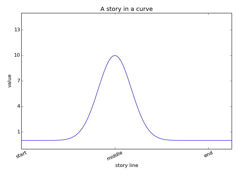
>>> tight_layout()
>>> savefig('ticks_labels3.png')
annotate -- label + arrow
>>> annotate('starts\nto get ugly',
...                   xy=(6, 6.6),
...                   xytext=(7, 8),
...                   arrowprops=dict(facecolor='black'))
<matplotlib.text.Annotation object at 0x353de90>
>>> savefig('annotations1.png')
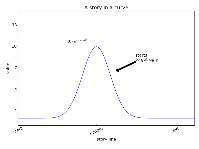
text -- just a label... latex is accepted
>>> text(3.5, 10.5, '$10*e^{-(x-5)^{2}}$')
<matplotlib.text.Text object at 0x3549c10>
>>> savefig('annotations2.png')
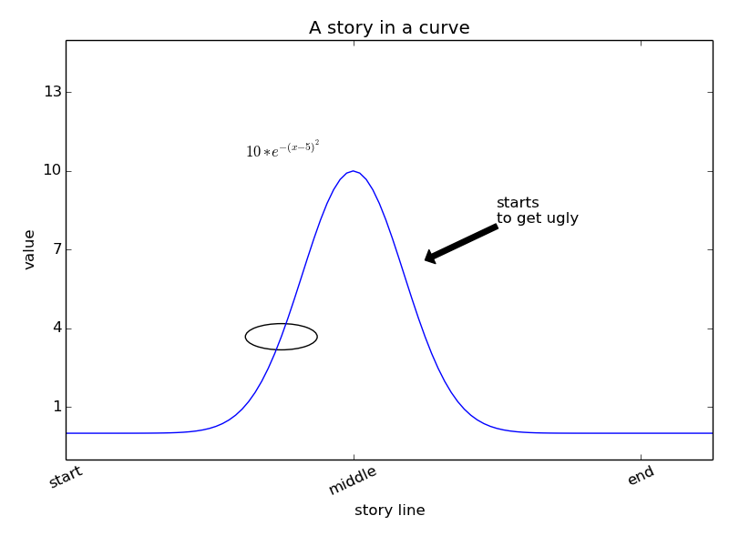
Circle is an "artist", the route of most shapes, e.g. arrows, etc.
>>> ax = gca() # get-current-axes
>>> # default to "data" units,
>>> circ = Circle((4, 10*exp(-1)), radius=.5, fill=False)
>>> ax.add_artist(circ)
<matplotlib.patches.Circle object at 0x3555050>
>>> savefig('annotations3.png')
Problem 2
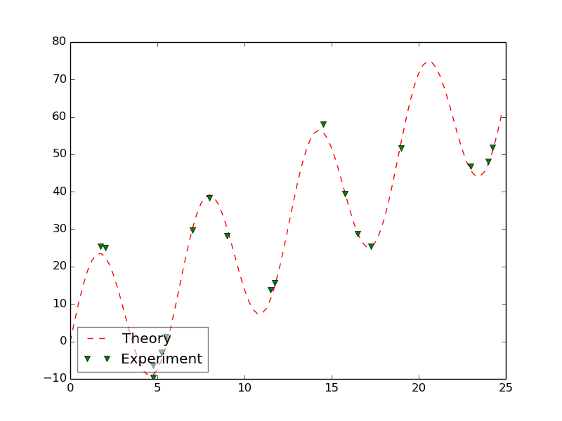
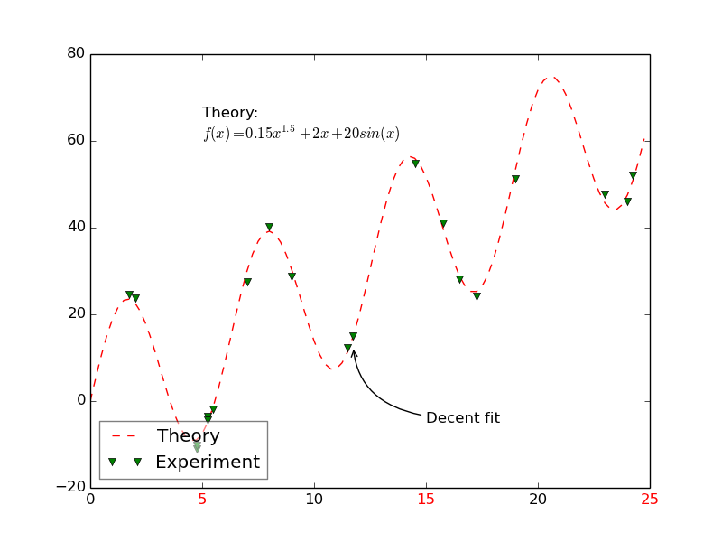
# step1
# annotate the point (11.75, 12.5)
# and place the message "Decent fit"
# at position (15, -5)
# for the arrowprops keyword
# create a dictionary with 2 keys: arrowstyle and connectionstyle
# use an arrowtyle='->'
# with connectionstyle= "angle3,angleA=180,angleB=95"
# see the docs for more info:
# http://matplotlib.org/api/axes_api.html?highlight=arrow#matplotlib.axes.Axes.annotate
# http://matplotlib.org/api/artist_api.html?highlight=fancyarrowpatch#matplotlib.patches.FancyArrowPatch
# step2
# place the text: "Theory:\n$f(x) = 0.15x^{1.5} + 2x + 20sin(x)$"
# at position (5, 60)
# step3
# make the odd xtick marks red
# a. use xticks() to get both a list of positions and labels
# b. if position is odd (odd_number%2 == 1), make label red using, set_color('red')
- matplotlib.org
- quick search
- "xticks"
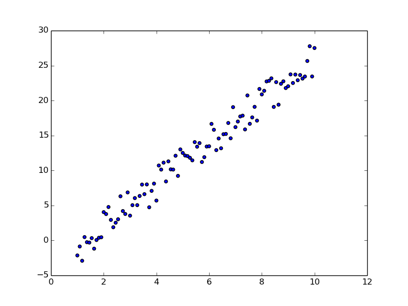
scatter is used to place a symbol at each x, y value.
>>> figure()
<matplotlib.figure.Figure object at 0x3620250>
>>> x = linspace(1, 10, 100)
>>> y = x*3 - 4 + (random(100) - .5) * 5
>>> scatter(x, y)
<matplotlib.collections.PathCollection object at 0x3b06a50>
>>> savefig('scatter1.png')
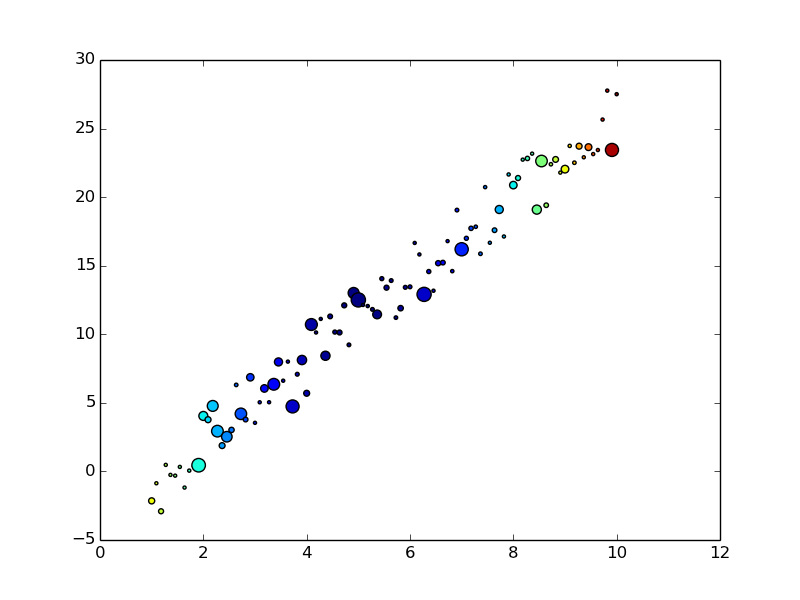
With scatter you can control size and color, to show 4D data.
>>> figure()
<matplotlib.figure.Figure object at 0x3b13a90>
>>> w = (random(100))**4
>>> z = (x-5)**2
>>> wrange = max(w) - min(w)
>>> # in pixels**2
>>> wsize = (w-min(w))/wrange*100+5
>>> scatter(x, y, c=z, s=wsize)
<matplotlib.collections.PathCollection object at 0x3eaa310>
>>> savefig('scatter2.png')
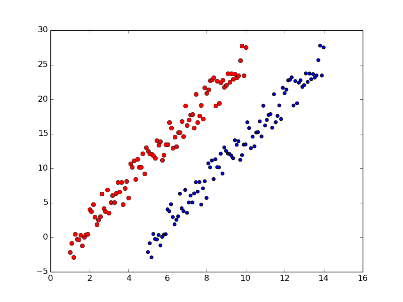
plot can be like scatter
>>> figure()
<matplotlib.figure.Figure object at 0x31f2c10>
>>> plot(x,y, 'ro')
[<matplotlib.lines.Line2D object at 0x42682d0>]
>>> scatter(x+4, y)
<matplotlib.collections.PathCollection object at 0x4268950>
>>> savefig('scatter3.png')
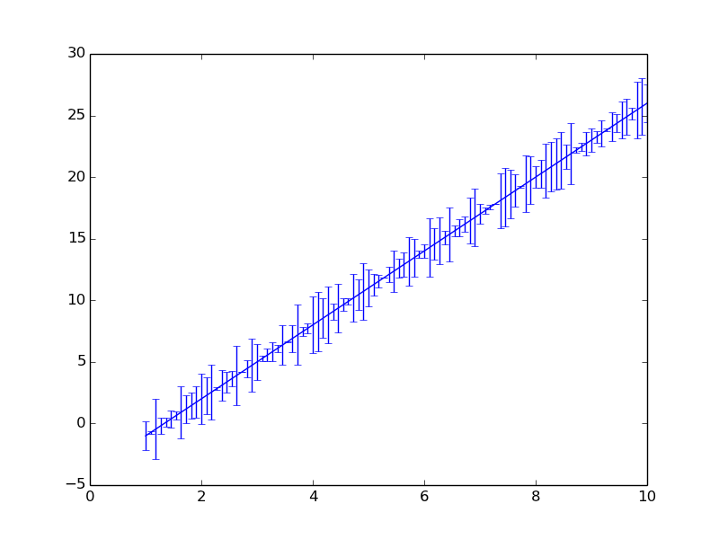
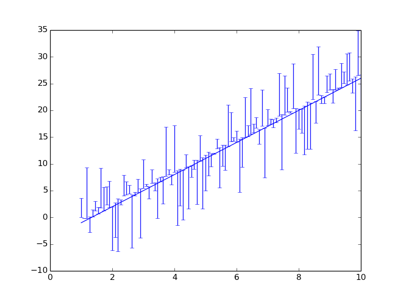
errorbar -- like plot with error bars (shocking I know)
>>> figure()
<matplotlib.figure.Figure object at 0x4279f90>
>>> ytheory = x*3 - 4
>>> errorbar(x, ytheory , yerr=(y-ytheory))
<Container object of 3 artists>
>>> savefig('error1.png')
>>> figure()
<matplotlib.figure.Figure object at 0x3524d10>
>>> ytheory = x*3 - 4
>>> errorbar(x, ytheory , yerr=((y-ytheory)*4, random(100)), )
<Container object of 3 artists>
>>> savefig('error2.png')
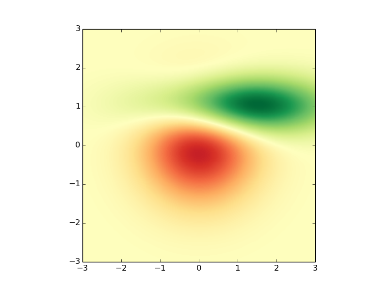
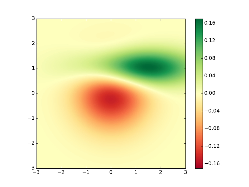
>>> import matplotlib.mlab as mlab
>>> figure()
<matplotlib.figure.Figure object at 0x4641e50>
>>> x = y = np.arange(-3.0, 3.0, 0.025)
>>> X, Y = np.meshgrid(x, y)
>>> Z1 = mlab.bivariate_normal(X, Y, 1.0, 1.0, 0.0, 0.0)
>>> Z2 = mlab.bivariate_normal(X, Y, 1.5, 0.5, 1, 1)
>>> Z = Z2-Z1  # difference of Gaussians
imshow intended for showing images, used for showing Matricies
>>> im = plt.imshow(Z,
...                 interpolation='bilinear',
...                 cmap='RdYlGn',
...                 origin='lower',
...                 extent=[-3,3,-3,3],
...                 vmax=abs(Z).max(),
...                 vmin=-abs(Z).max())
>>> savefig('imshow1.png')
colorbar is like legend for color scales.
>>> colorbar(im)
<matplotlib.colorbar.Colorbar instance at 0x52e02d8>
>>> savefig('imshow2.png')
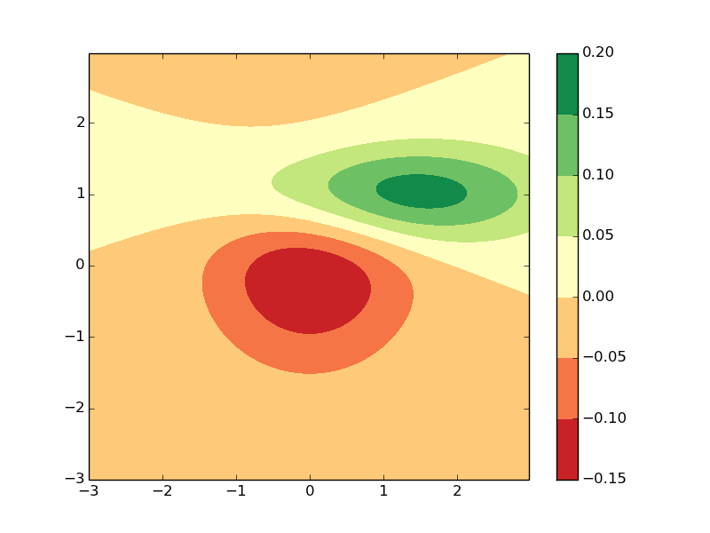
contorf is filled contours
>>> figure()
<matplotlib.figure.Figure object at 0x52ebcd0>
>>> cf = contourf(x, y, Z, cmap='RdYlGn')
>>> colorbar(cf)
<matplotlib.colorbar.Colorbar instance at 0x5a2e6c8>
>>> savefig('contourf.png')
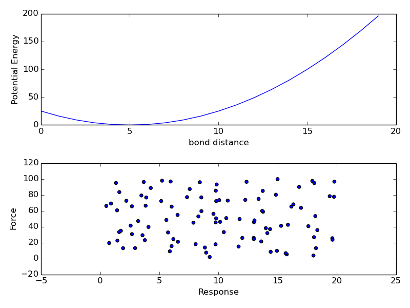
subplots are just axes organized on a grid.
figure()
subplot(211) # nrows, ncols, axes_num
plot((arange(20)-5)**2)
xlabel('bond distance')
ylabel('Potential Energy')
subplot(212)
scatter(random(100)*20, random(100)*100)
xlabel('Response')
ylabel('Force')
tight_layout()
savefig('subplots.png')
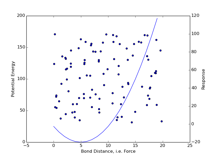
twinx, twiny make two scales on same axes
>>> figure()
<matplotlib.figure.Figure object at 0x3739450>
>>> line1 =  plot((arange(20)-5)**2)
>>> ylab1 = ylabel('Potential Energy')
>>> xlab = xlabel('Bond Distance, i.e. Force')
>>> twinx() # <- new axes sharing x range
<matplotlib.axes.AxesSubplot object at 0x376d190>
>>> scat1 = scatter(random(100)*20, random(100)*100)
>>> ylab2 = ylabel('Response')
>>> savefig('twinx.png')
Backends
This is the code that controls 1) gui or 2) image creation.
tkagg, webagg, pdf, ps, svg, wx/wxagg, cocoaagg
Missing ones:
gtk/gtk3/gtkagg, qt4/qt4agg, cairo/gtkcairo
Not Like this:
>>> import matplotlib.pyplot as plt
>>> import matplotlib
>>> matplotlib.use('PS')
/usr1/scv/yannpaul/scvnb/etc/apps/matplotlib/matplotlib_1.3/lib/python2.7/site-packages/matplotlib-1.3.0-py2.7-linux-x86_64.egg/matplotlib/__init__.py:1141: UserWarning:  This call to matplotlib.use() has no effect
because the the backend has already been chosen;
matplotlib.use() must be called *before* pylab, matplotlib.pyplot,
or matplotlib.backends is imported for the first time.

  warnings.warn(_use_error_msg)
But like this
>>> import matplotlib
>>> matplotlib.use('PS')
>>> import matplotlib.pyplot as plt
>>> from pylab import *
Configure Defaults
- backend
- font, font size
- savefig behavior
>>> import matplotlib
>>> matplotlib.rcParams['lines.linewidth'] = 2
>>> matplotlib.rcParams['lines.color'] = 'r'
>>> # where is the config file?
>>> # matplotlib.matplotlib_fname()
Event Handling
legend_picking.py
Try this example out:
cd mpl_examples/event_handling/legend_picking.py
python legend_picking.py
"""
Enable picking on the legend to toggle the legended line on and off
"""
import numpy as np
import matplotlib.pyplot as plt

t = np.arange(0.0, 0.2, 0.1)
y1 = 2*np.sin(2*np.pi*t)
y2 = 4*np.sin(2*np.pi*2*t)

fig, ax = plt.subplots()
ax.set_title('Click on legend line to toggle line on/off')
line1, = ax.plot(t, y1, lw=2, color='red', label='1 HZ')
line2, = ax.plot(t, y2, lw=2, color='blue', label='2 HZ')
leg = ax.legend(loc='upper left', fancybox=True, shadow=True)
leg.get_frame().set_alpha(0.4)
# we will set up a dict mapping legend line to orig line, and enable
# picking on the legend line
lines = [line1, line2]
lined = dict()
for legline, origline in zip(leg.get_lines(), lines):
    legline.set_picker(5)  # 5 pts tolerance
    lined[legline] = origline
# blank line
def onpick(event):
    # on the pick event, find the orig line corresponding to the
    # legend proxy line, and toggle the visibility
    legline = event.artist
    origline = lined[legline]
    vis = not origline.get_visible()
    origline.set_visible(vis)
    # Change the alpha on the line in the legend so we can see what lines
    # have been toggled
    if vis:
        legline.set_alpha(1.0)
    else:
        legline.set_alpha(0.2)
    fig.canvas.draw()

fig.canvas.mpl_connect('pick_event', onpick)

plt.show()
Problem 3
# step 1
# make a routine that takes an axes
# and plots the theory and experiment from
# problem 1 and 2
def plot1(axes):
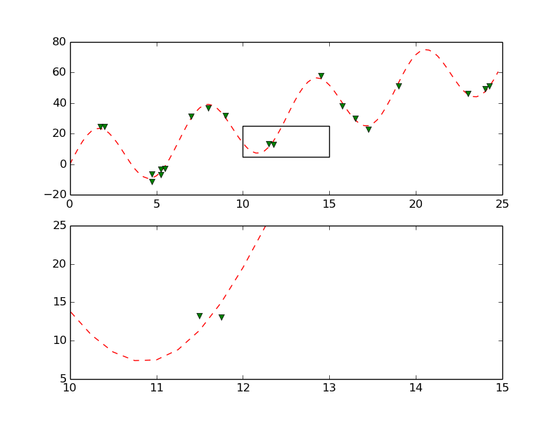
# step 2
# make a routine that takes a tuple (x, y)
# and updates the rect position using set_xy
# and updates the xlim and ylim of the second subplot using
# the x, y, width, height and set_xlim and set_ylim
# methods
def highlight(xy):
    width = 5
    height = 20
# write a routine that takes an event and calls
# the highlight routine passing (event.xdata, event.ydata)
# and then it redraws the figure.
def onpick(event):
# step 4
# make two subplots
# call plot_theory_exp on each axes
# add the artist rect to the first axes
# call highlight at position (10, 5)
Extensions
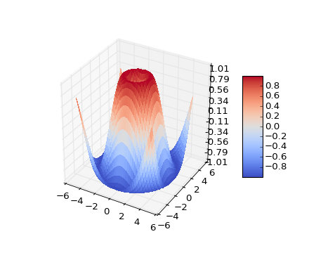
mplot3D
mpl_examples/mplot3d/surface3d_demo.py
3D module:
from mpl_toolkits.mplot3d import Axes3D
Everything Else:
from matplotlib import cm
from matplotlib.ticker import LinearLocator, FormatStrFormatter
import matplotlib.pyplot as plt
import numpy as np
Get Axes Ready
fig = plt.figure()
ax = fig.gca(projection='3d')
Generate data
X = np.arange(-5, 5, 0.25)
Y = np.arange(-5, 5, 0.25)
X, Y = np.meshgrid(X, Y)
R = np.sqrt(X**2 + Y**2)
Z = np.sin(R)
Make a Surface
surf = ax.plot_surface(X, Y, Z, rstride=1, cstride=1, cmap=cm.coolwarm,
        linewidth=0, antialiased=False)
ax.set_zlim(-1.01, 1.01)
ax.zaxis.set_major_locator(LinearLocator(10))
ax.zaxis.set_major_formatter(FormatStrFormatter('%.02f'))

fig.colorbar(surf, shrink=0.5, aspect=5)

plt.show()