Anyone who has witnessed a thunderstorm, tornado, or hurricane can appreciate the serious effects of terrestrial weather. Just as the dynamics of the atmosphere have important consequences, the mostly unseen dynamics of the Earth's space environment are also important to us on the ground. Satellites can be destroyed by enhanced radiation or set tumbling by changes in the local magnetic field, and communications and power distribution grids can be disrupted. As more of our technological base becomes dependent on space-based assets, the development of accurate forecast models for "Space Weather" becomes more and more important.
The National Science Foundation has recently funded a Science and Technology Center at Boston University, The Center for Integrated Space Weather Modeling (CISM), to address this need. The Center's charter is to develop a coupled chain of physics-based simulations for space weather effects that runs from the surface of the Sun to the Earth's atmosphere. In this effort, CISM will be partnering with the Scientific Computing and Visualization group and the Center for Computational Science at Boston University.

|
|
|
|
The original stereo high resolution movies were all produced by Ray Gasser and
the downsampling and web conversion was done by Aaron D. Fuegi, both members
of the Scientific Computing and Visualization group at Boston University.
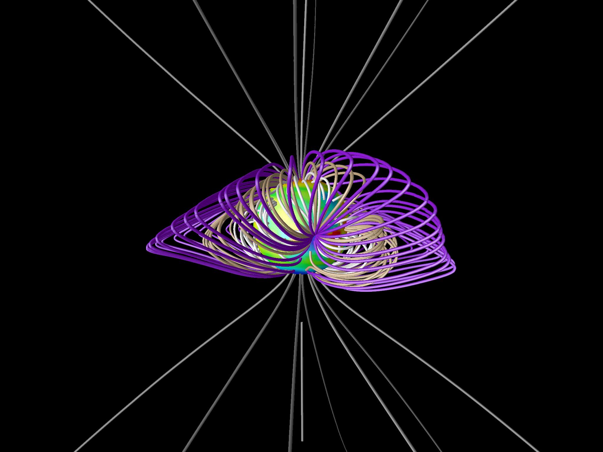 This movie shows a model visualization of the Sun's magnetic field in
the solar corona. The sphere in the center represents the sun's visible
surface, and the color scale represents values of the observed surface
magnetic field (red is pointing inward and blue out). The solar magnetic
field is generated by current flows deep in the sun, but it is modified
by the solar wind flowing out from the sun. Initially, only the
field-lines at the poles are represented in white. These lines are
"open" meaning that they do not connect directly back to the sun but
continue on to interstellar space. As the movie continues, closed field
lines are added near the sun. The movie ends with the last closed field
lines (in purple) and the first open field lines (in red) that are
draped around the closed field lines. (Courtesy S. McGregor)
(31MB AVI,
190MB QuickTime)
This movie shows a model visualization of the Sun's magnetic field in
the solar corona. The sphere in the center represents the sun's visible
surface, and the color scale represents values of the observed surface
magnetic field (red is pointing inward and blue out). The solar magnetic
field is generated by current flows deep in the sun, but it is modified
by the solar wind flowing out from the sun. Initially, only the
field-lines at the poles are represented in white. These lines are
"open" meaning that they do not connect directly back to the sun but
continue on to interstellar space. As the movie continues, closed field
lines are added near the sun. The movie ends with the last closed field
lines (in purple) and the first open field lines (in red) that are
draped around the closed field lines. (Courtesy S. McGregor)
(31MB AVI,
190MB QuickTime)
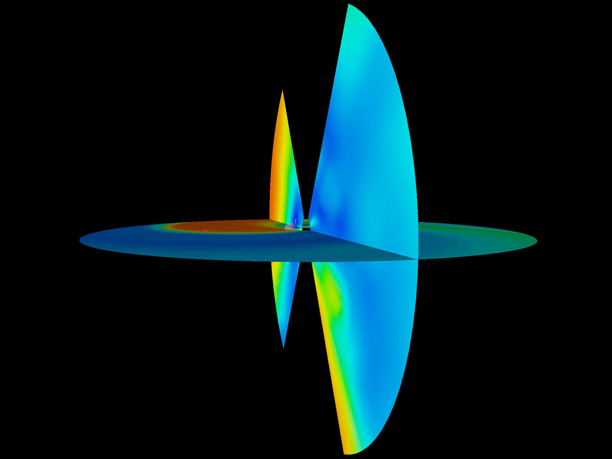
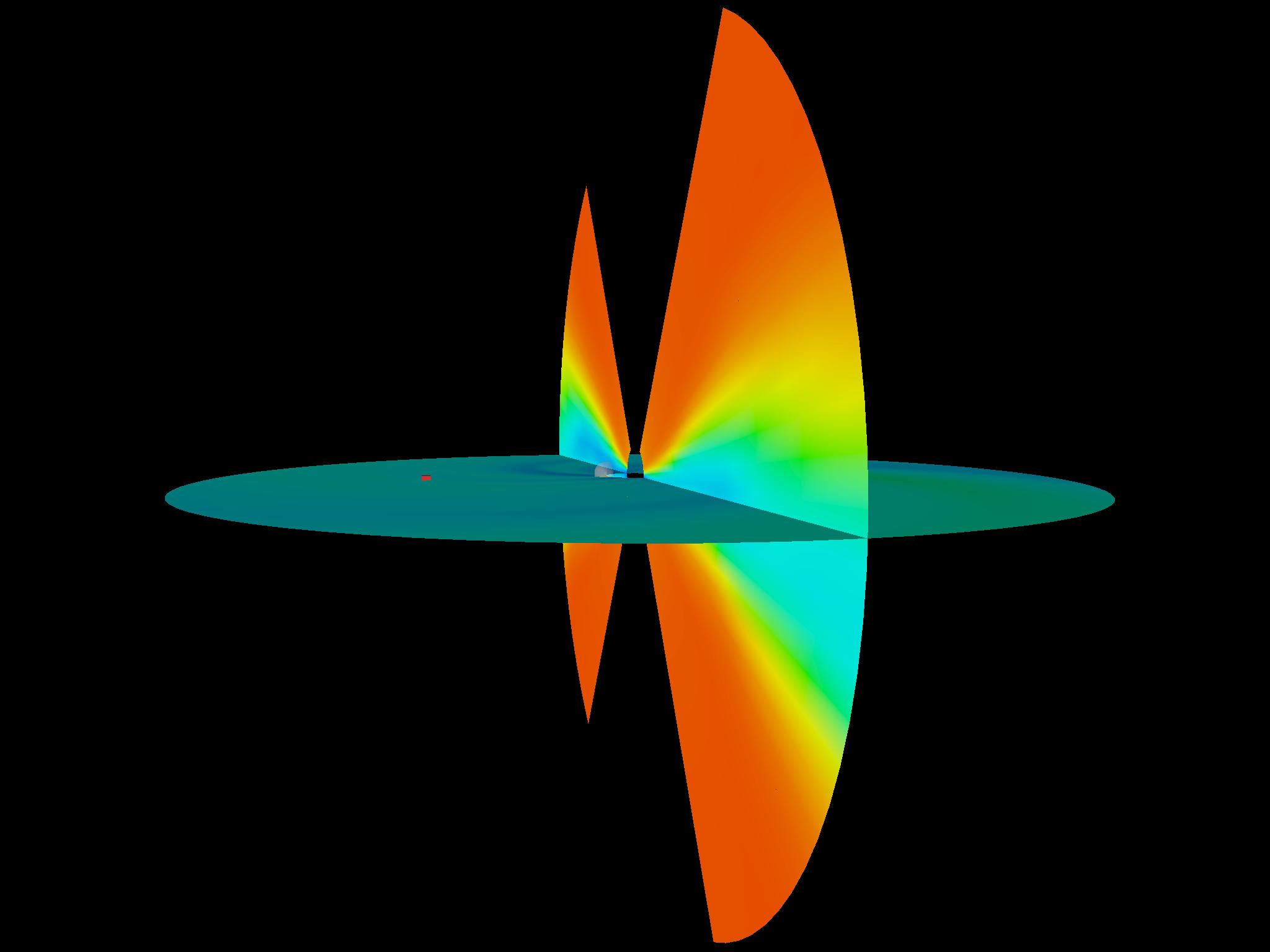
 The movie shows a model visualization of the Sun’s outer atmosphere, the
corona. The sphere in the center represents the sun’s visible surface, and the
gray-scale values are derived from observations of the surface magnetic field.
The model magnetic field lines that are computed from that inner boundary are
colored in red, and the surface at which the magnetic field polarity reverses
is the current sheet, visualized as the surface near the heliospheric equator.
This current sheet is colored with the value of solar wind radial velocity.
(Courtesy S. McGregor)
(14MB AVI,
60MB QuickTime)
The movie shows a model visualization of the Sun’s outer atmosphere, the
corona. The sphere in the center represents the sun’s visible surface, and the
gray-scale values are derived from observations of the surface magnetic field.
The model magnetic field lines that are computed from that inner boundary are
colored in red, and the surface at which the magnetic field polarity reverses
is the current sheet, visualized as the surface near the heliospheric equator.
This current sheet is colored with the value of solar wind radial velocity.
(Courtesy S. McGregor)
(14MB AVI,
60MB QuickTime)
 (23MB AVI, 170MB QuickTime) 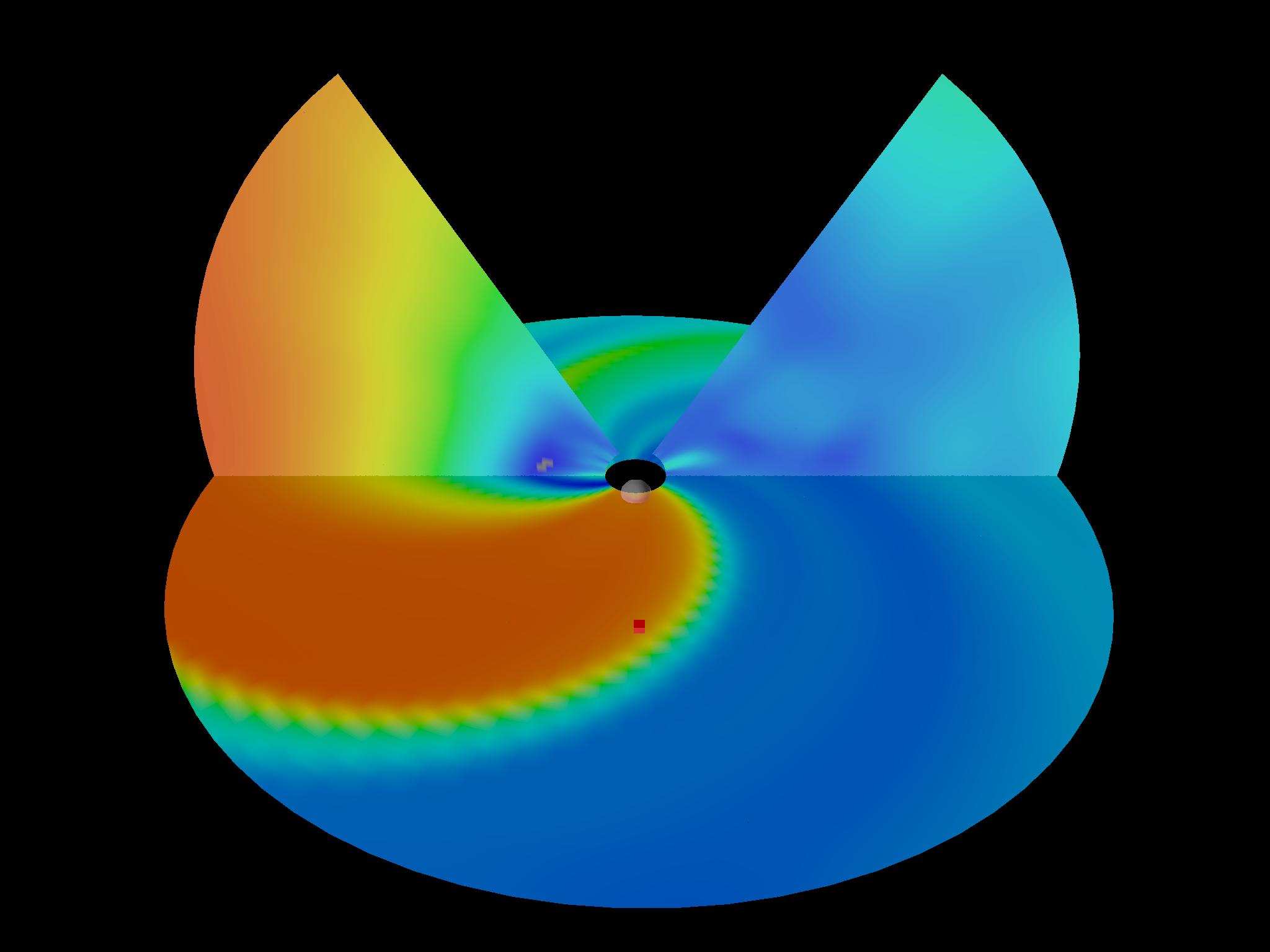 (31MB AVI, 347MB QuickTime) |
The next four movies show simulation results for Coronal Mass Ejections (CME's) traveling from the Sun to the Earth. There are two different events depicted here, each viewed from the front and the side. The sun is at the center of the simulation "hole" and the red cube marks the position of the earth. (Neither is visible at this scale). In each view the cut planes are colored according to the speed of the solar wind (red is fast and blue is slow). The increased density due to the CME is indicated by a translucent white density iso-surface that propagates out from the center. The first two movies (shown at left) depict a situation near solar minimum where the solar wind is more organized with high speed solar wind at high latitudes and slower wind at lower latitudes. As the CME expands out from the sun, it interacts with the solar wind and is drawn into a particular shape. The second two movies (shown at right) show a case near solar maximum where the solar wind is less organized. The CME again conforms to the solar wind but this time has a more irregular structure. |
 (46MB AVI, 158MB QuickTime) 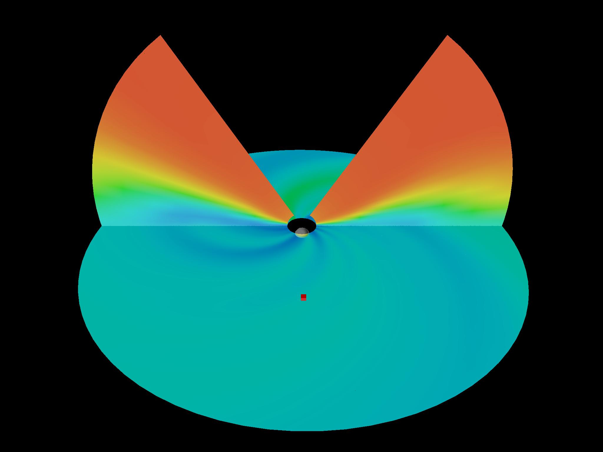 (21MB AVI, 267MB QuickTime) |
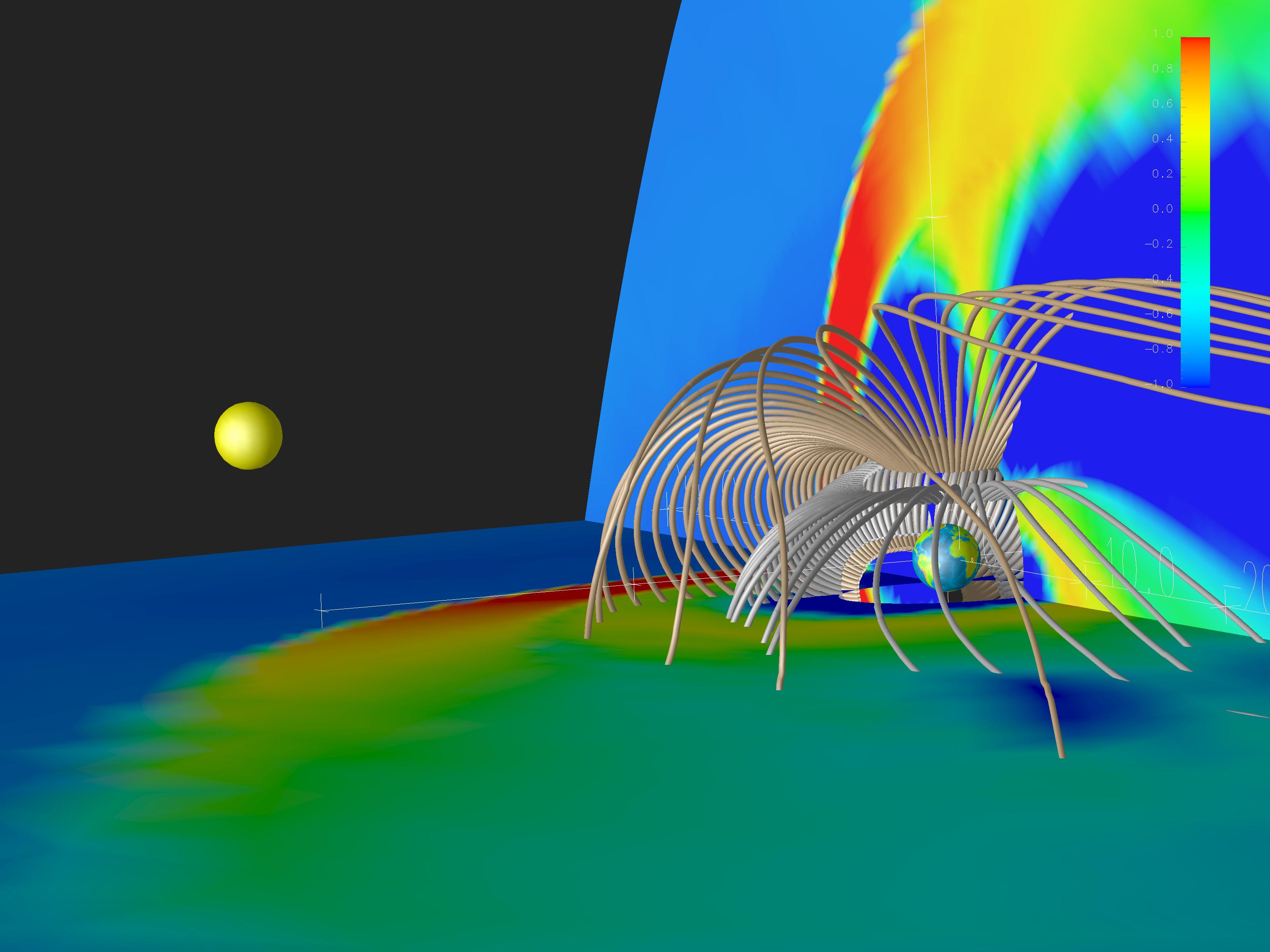
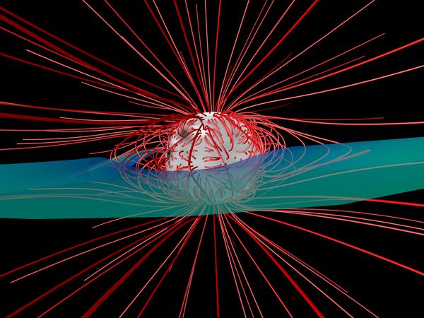
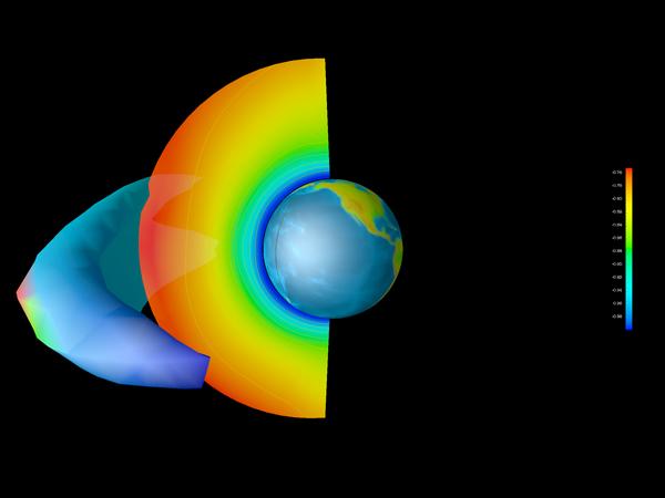
 This illustrates the way the magnetospheric model is initialized. Initially,
there is a dipole field set up in the center of the simulation axes. Drawn are
two sets of magnetic field lines, starting at two different latitudes on the
earth. First, unmagnetized solar wind is blown into the simulation domain
which will form a realistic magnetospheric cavity. At some later time, the
solar wind direction changes (according to the real orientation of the Earth's
dipole field relative to the solar wind) and the solar wind magnetic field is
convected in, stripping some of the earth's field away and varying according to
upstream spacecraft measurements. (Courtesy John Lyon & T. Guild)
(16MB AVI,
47MB QuickTime)
This illustrates the way the magnetospheric model is initialized. Initially,
there is a dipole field set up in the center of the simulation axes. Drawn are
two sets of magnetic field lines, starting at two different latitudes on the
earth. First, unmagnetized solar wind is blown into the simulation domain
which will form a realistic magnetospheric cavity. At some later time, the
solar wind direction changes (according to the real orientation of the Earth's
dipole field relative to the solar wind) and the solar wind magnetic field is
convected in, stripping some of the earth's field away and varying according to
upstream spacecraft measurements. (Courtesy John Lyon & T. Guild)
(16MB AVI,
47MB QuickTime)
 This movie is a substorm simulation with the plane colored in the logarithm of
the density, a translucent isosurface of the plasma sheet volume, and red
vectors that show the flows within the plasma sheet. Now there are also two
sets of field lines (gray & gold) that are started at different latitudes.
Note near the middle of the movie, there is a region in the plasma sheet where
the flow vectors start diverging, and some of the plasma goes very quickly
toward the earth, whereas some goes quickly away from the earth. Also see the
surface break and some of it go away from the earth. This is the time sequence
of a substorm, and the plasma going away from the earth is called a plasmoid.
(Courtesy T. Guild)
(78MB AVI,
385MB QuickTime)
This movie is a substorm simulation with the plane colored in the logarithm of
the density, a translucent isosurface of the plasma sheet volume, and red
vectors that show the flows within the plasma sheet. Now there are also two
sets of field lines (gray & gold) that are started at different latitudes.
Note near the middle of the movie, there is a region in the plasma sheet where
the flow vectors start diverging, and some of the plasma goes very quickly
toward the earth, whereas some goes quickly away from the earth. Also see the
surface break and some of it go away from the earth. This is the time sequence
of a substorm, and the plasma going away from the earth is called a plasmoid.
(Courtesy T. Guild)
(78MB AVI,
385MB QuickTime)
 Same movie, and same caption as the movie above. Viewpoint is just further
away from the magnetosphere.
(80MB AVI,
333MB QuickTime)
Same movie, and same caption as the movie above. Viewpoint is just further
away from the magnetosphere.
(80MB AVI,
333MB QuickTime)
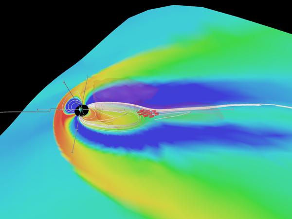
 This movie is a substorm simulation as viewed from above (and behind) the north
pole. This visualization shows the velocity colored on the equatorial plane,
with blue indicating fast flow away from the sun (solar wind) and red
indicating fast flow toward the sun (inside the magnetosphere, and it's called
flow bursts). When the velocity is faster than 350 km/s red vectors are drawn.
This illustrates the meso-scale structure inherent in the substorm energy
transfer event. It's not just a divergence of flows, as you would expect from
the previous substorm simulation movies but has a very complicated structure in
the equatorial plane. (Courtesy T. Guild)
(77MB AVI,
291MB QuickTime)
This movie is a substorm simulation as viewed from above (and behind) the north
pole. This visualization shows the velocity colored on the equatorial plane,
with blue indicating fast flow away from the sun (solar wind) and red
indicating fast flow toward the sun (inside the magnetosphere, and it's called
flow bursts). When the velocity is faster than 350 km/s red vectors are drawn.
This illustrates the meso-scale structure inherent in the substorm energy
transfer event. It's not just a divergence of flows, as you would expect from
the previous substorm simulation movies but has a very complicated structure in
the equatorial plane. (Courtesy T. Guild)
(77MB AVI,
291MB QuickTime)
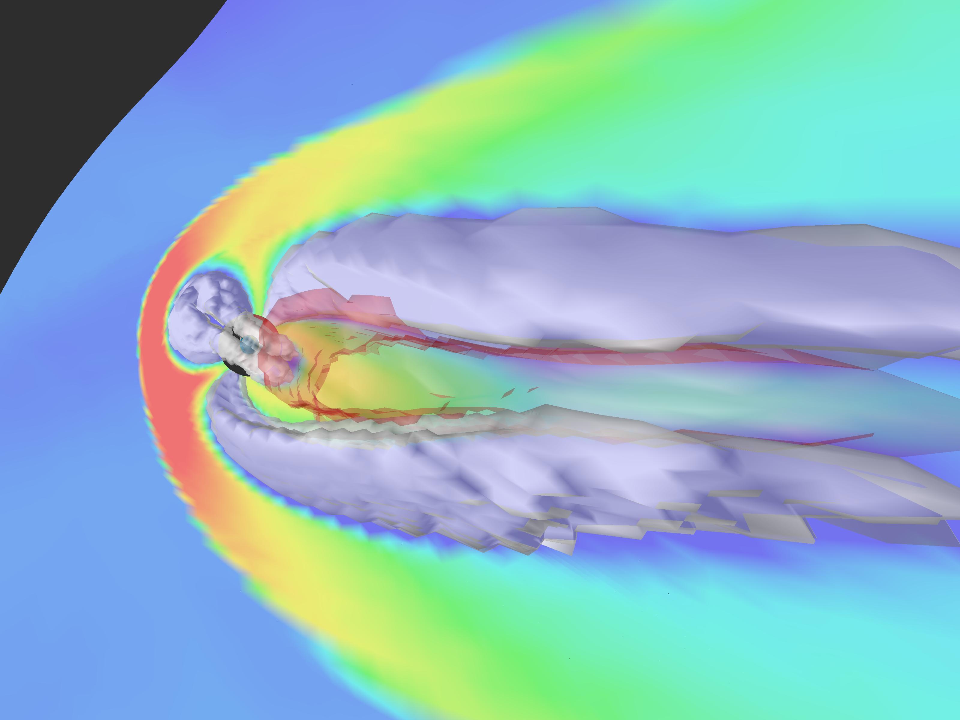
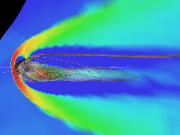
 This is a view of the magnetosphere from the side, with the plane colored in
the logarithm of the density. There are white terrestrial magnetic field
lines, which are usually only connected to the Earth. Whenever the plasma flow
is going sunward fast (> 350 km/s) we draw red arrows indicating the direction
and magnitude. This is a simulation of a substorm, where a small amount of
solar wind energy couples into the Earth’s magnetosphere. The solar wind
magnetic field turns opposite to the earth's field at the front of the
magnetosphere, reconnection allows the magnetosphere to load with the solar
wind energy, and once the stress is too great in the tail (behind the earth),
reconnection happens again, ejecting plasma earthward and tailward. (Courtesy
T. Guild)
(70MB AVI,
269MB QuickTime)
This is a view of the magnetosphere from the side, with the plane colored in
the logarithm of the density. There are white terrestrial magnetic field
lines, which are usually only connected to the Earth. Whenever the plasma flow
is going sunward fast (> 350 km/s) we draw red arrows indicating the direction
and magnitude. This is a simulation of a substorm, where a small amount of
solar wind energy couples into the Earth’s magnetosphere. The solar wind
magnetic field turns opposite to the earth's field at the front of the
magnetosphere, reconnection allows the magnetosphere to load with the solar
wind energy, and once the stress is too great in the tail (behind the earth),
reconnection happens again, ejecting plasma earthward and tailward. (Courtesy
T. Guild)
(70MB AVI,
269MB QuickTime)
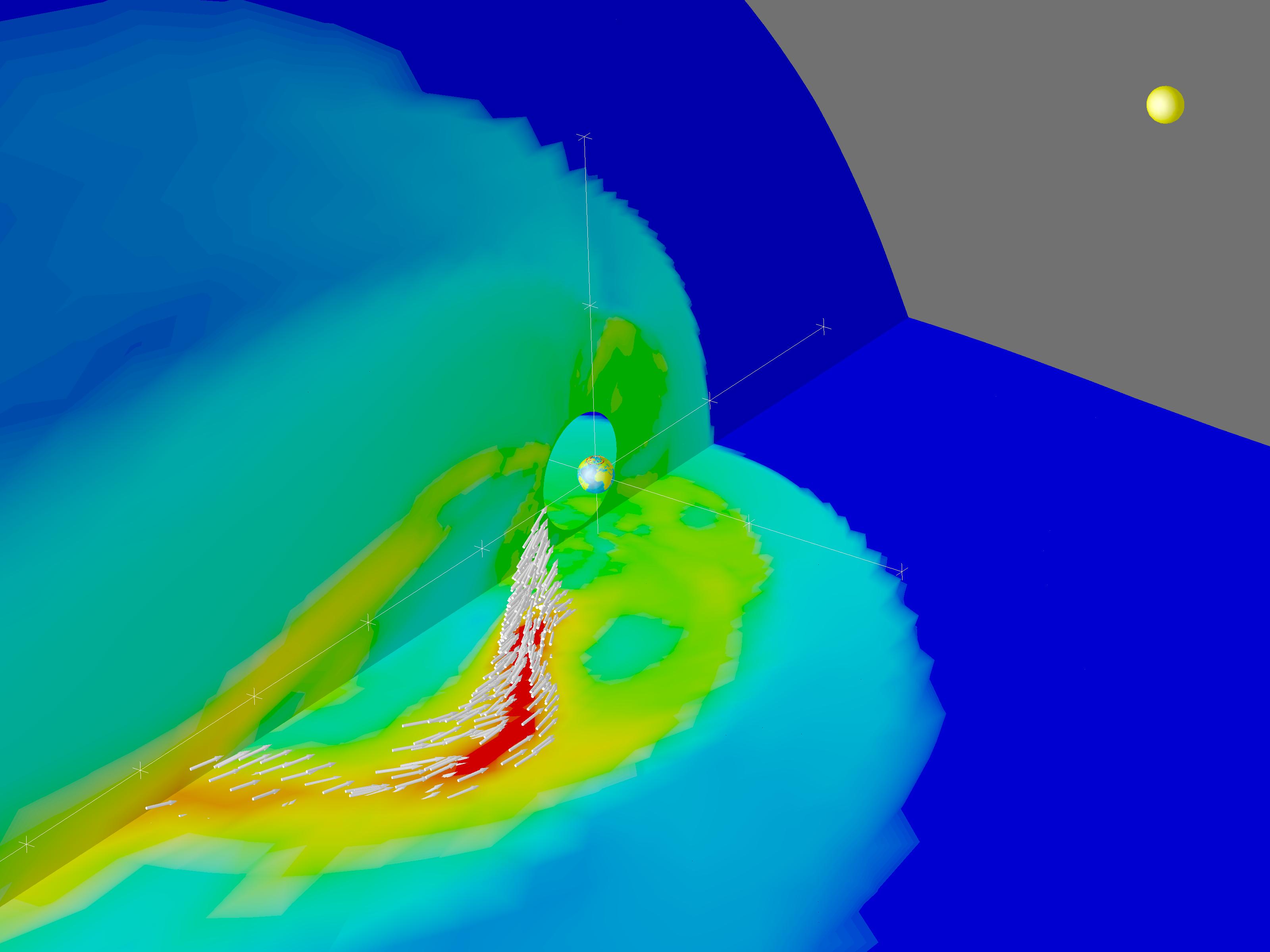
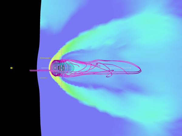
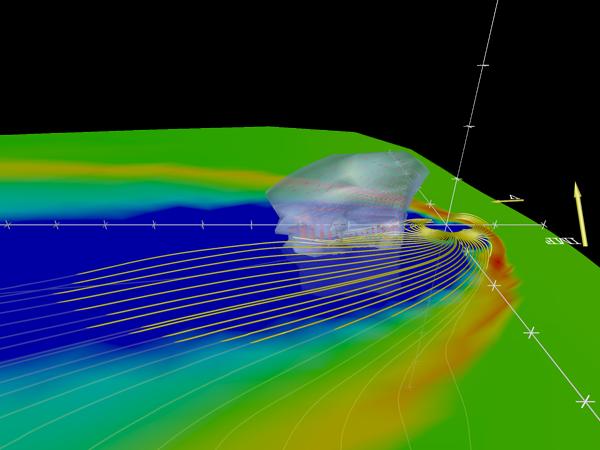 Viewed from above. The plane is colored in the logarithm of the density, there
are yellow magnetic field lines, two vectors upstream of the grid are the
incoming velocity vector, and interplanetary magnetic field (IMF) vector. The
translucent surface anti-sunward of the earth is the plasma sheet, a region of
hot plasma through which energy gets transferred into the near-Earth region.
Inside that, are red vectors which show the velocity of flows. This is a
short demo, comprising only a few time steps of the simulation. (Courtesy
T. Guild)
(3MB AVI,
13MB QuickTime)
Viewed from above. The plane is colored in the logarithm of the density, there
are yellow magnetic field lines, two vectors upstream of the grid are the
incoming velocity vector, and interplanetary magnetic field (IMF) vector. The
translucent surface anti-sunward of the earth is the plasma sheet, a region of
hot plasma through which energy gets transferred into the near-Earth region.
Inside that, are red vectors which show the velocity of flows. This is a
short demo, comprising only a few time steps of the simulation. (Courtesy
T. Guild)
(3MB AVI,
13MB QuickTime)
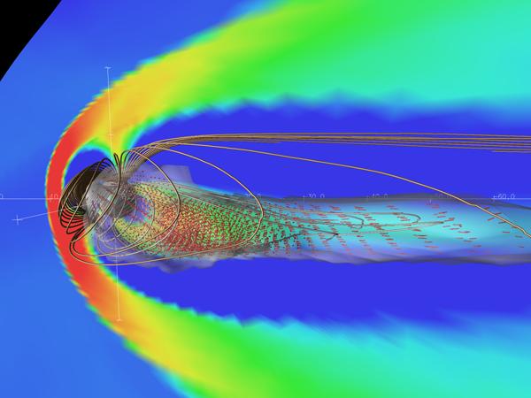
 This visualization illustrates everything from the substorm simulation in the
previous visualizations. Movies 2, 3, and 4 on this page show the substorm
from a fixed vantage point, whereas this one flies the camera through the
volume. Shown are planes colored in density, two sets of field lines, red
vectors during fast flows, and a translucent surface bounding the plasma
sheet. (Courtesy T. Guild)
(62MB AVI,
244MB QuickTime)
This visualization illustrates everything from the substorm simulation in the
previous visualizations. Movies 2, 3, and 4 on this page show the substorm
from a fixed vantage point, whereas this one flies the camera through the
volume. Shown are planes colored in density, two sets of field lines, red
vectors during fast flows, and a translucent surface bounding the plasma
sheet. (Courtesy T. Guild)
(62MB AVI,
244MB QuickTime)
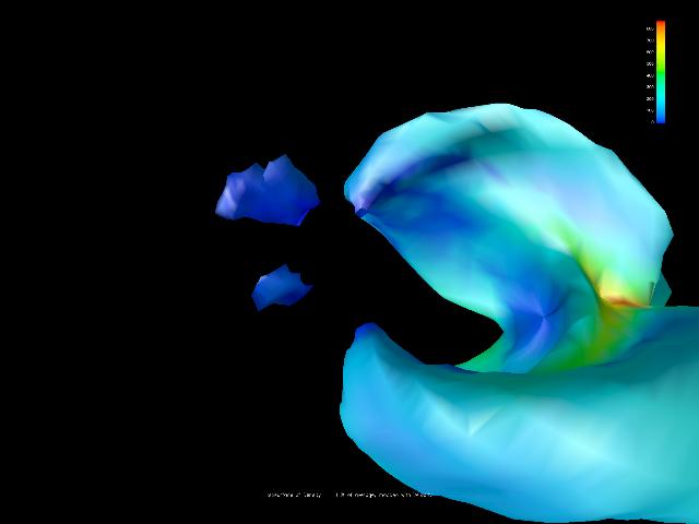 This visualization was made by a CISM undergraduate. It shows an isosurface of
density in the magnetosphere, and the surface is painted with the value of the
magnetic field. The value of the density defining the isosurface changes as a
function of time, from high to low density. The camera flies through the
volume where that isosurface changes as a function of time. (Courtesy
A. Pembroke)
(17MB AVI,
64MB QuickTime)
This visualization was made by a CISM undergraduate. It shows an isosurface of
density in the magnetosphere, and the surface is painted with the value of the
magnetic field. The value of the density defining the isosurface changes as a
function of time, from high to low density. The camera flies through the
volume where that isosurface changes as a function of time. (Courtesy
A. Pembroke)
(17MB AVI,
64MB QuickTime)
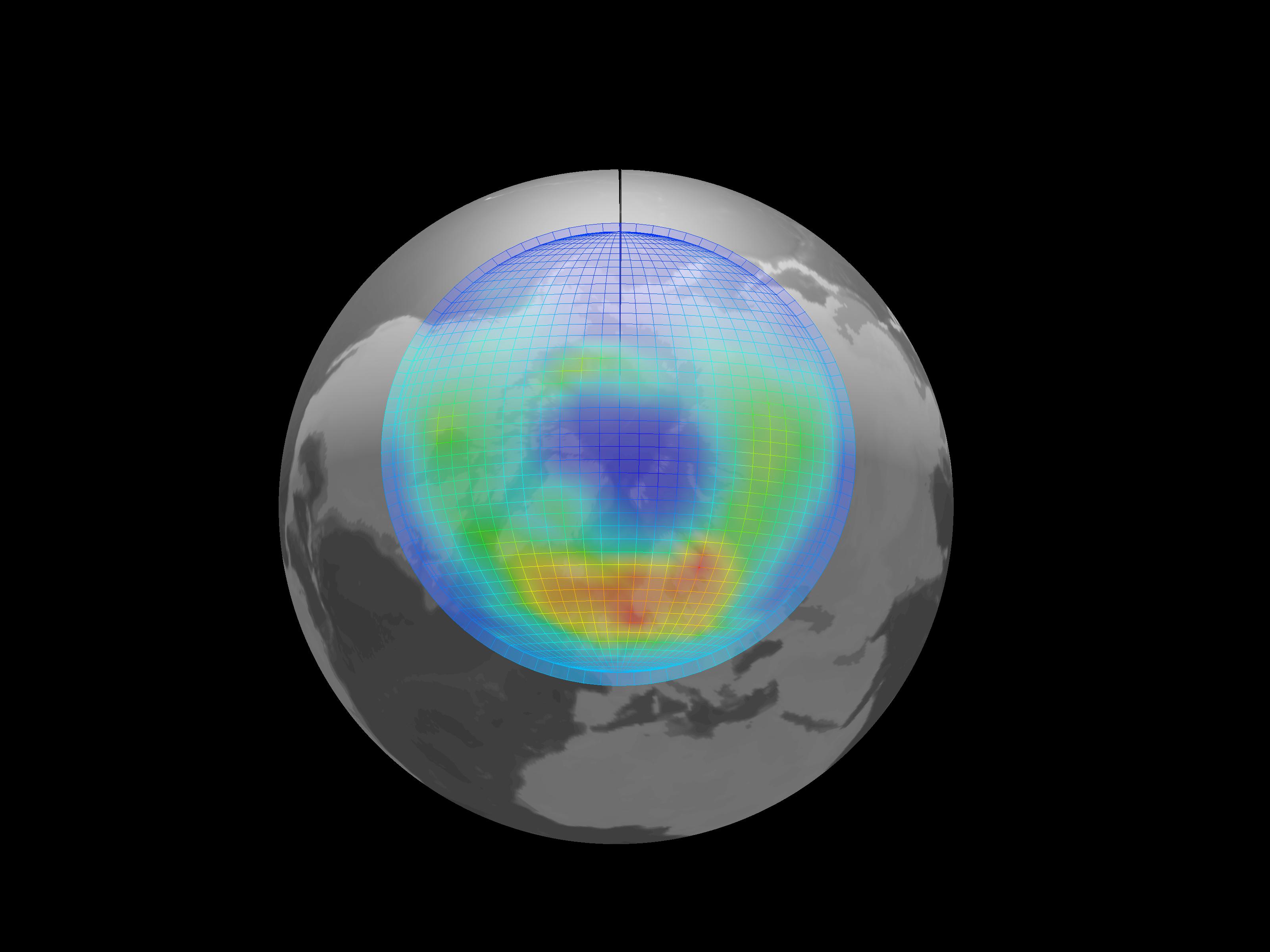
 This is a visualization of the TING (Thermosphere-Ionosphere Nested Grid)
model. The thermosphere is the tenuous region of the upper atmosphere,
dominated by an increasing temperature profile with altitude. The ionosphere
is the conducting layer within the thermosphere, which directly participates in
space weather dynamics, as driven by the magnetosphere. Shown in this
visualization is the temperature profile of the upper atmosphere ions as
computed by the TING model (colored slice) and an isosurface of electron
density. The peak of electron density is usually at noon, due to the solar
ultraviolet light ionizing atmospheric species. (Courtesy M. Wiltberger)
(10MB AVI,
34MB QuickTime)
This is a visualization of the TING (Thermosphere-Ionosphere Nested Grid)
model. The thermosphere is the tenuous region of the upper atmosphere,
dominated by an increasing temperature profile with altitude. The ionosphere
is the conducting layer within the thermosphere, which directly participates in
space weather dynamics, as driven by the magnetosphere. Shown in this
visualization is the temperature profile of the upper atmosphere ions as
computed by the TING model (colored slice) and an isosurface of electron
density. The peak of electron density is usually at noon, due to the solar
ultraviolet light ionizing atmospheric species. (Courtesy M. Wiltberger)
(10MB AVI,
34MB QuickTime)